Friday, September 30, 2011

Review: Thundercats 6 inch Lion-O

I was originally very skeptical of this 6in line of Thundercats figures. They really didnt seem to appeal to me, especially with the Classic line giving me figures from the original cartoon. Since I had sampled both the Classic and the 3 3/4 scale line, it was only fair that I pick up at least one of the 6in figures and try those out as well.

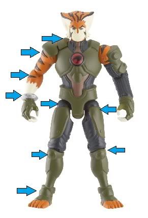
Lion-O has a pretty nice sculpt. Much nicer than the initial pictures had led me to believe. Holding him in my hands, i also now notice how similar this new costume is to the original version. It really does look like an update of that design, where i had originally thought it was a totally new design. The paint is nice and clean, with his armor parts being metallic paint. It gives a nice contrast to what looks like a plain dark blue body suit that he is wearing under the armor, and the silver edges to the armor really make the figure pop.

Now, right away i need to address some bad marks about this figure. This figure has the same problem that the Classic Lion-O figure had, the fact that the details of the sculpt blend together, especially on his hair and face. A little detailing work would really bring out how great the figure looks. As it stands, however, the entire head looks under detailed by comparison to the rest of the figure.

Also, the fur on the back of his calves is highly detailed and has a shaggy appearance to it. None of the other fur on his body has this amount of detail, and it looks strange by comparison. The straps on his leg armor have also been left unpainted, which isnt a hard fix with a steady hand, but people shouldnt have to take care of simple details that should have been painted in the first place.
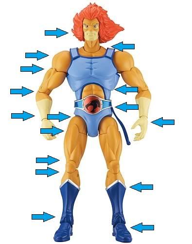
Articulation:

*ball joint head (rotation only)

*hinged neck (forward/back)

*disk/post shoulders

*bicep cut

*double hinged elbow

*forearm cut

*hinged wrist

*limited mid-torso (side to side only)

*ball joint waist (limited 360)

*disk/post hips

*thigh cut

*double hinged knee

*hinged ankle

*foot tilt

Lion-O again comes with the Sword of Omens in both extended and dagger versions, both including well painted Thundercat and Eye of Thundera emblems, respectively. The material used for the sword feels the same as the swords that came with Classic Lion-O, but i havent had as much warping so far.

He comes with 2 versions of the Claw Shield, with fingers extended and fingers retracted. The extended version is meant to replace the left hand, while the retracted version is to be hung from a strap similar to the one on Classic Lion-O. The strap is secured much better this time, and easily swings out of the way when posing. The retracted version is also slightly thinner, so it doesnt take up as much space hanging from the strap, which also means you can't put it on his arm with much success (although you can just squeeze it on if you want). There is a small bit of sculpted detail going from the strap to Lion-O's belt, giving the impression that he is actually wearing the strap, as opposed to having it just randomly floating there.

The extended claw shield doesnt work quite as well in practice this time around. First, while the Claw Shield accepts a small ball joint, the wrist joint on Lion-O actually uses a standard looking peg, which doesnt lend itself very well to popping off limbs, especially if you plan to swap them out on a regular basis. The Claw Shield is also pretty big, sitting almost to the elbow, which makes any articulation pointless. And to be perfectly honest, it doesnt look good on his arm. This is one normally vital accessory that is quickly going to find its way into my accessories bin, unfortunately.

I guess you can count this next bit as an accessory. From the moment i first starting seeing pictures of the new cartoon, i noticed the rather bulky pauldron he wears (the shoulder armor), and when the figures started getting announced, I noted that the pauldron looked even worse on the figures. Luckily, the pauldron on this version of the figure (dont know about the 3 3/4 figure) is simply pegged into the shoulder strap of his armor. It leaves a decent sized hole, but it is totally removable, and i fully plan to display him without it.

Now, this line of figures is billed as a 6in line. Of course that could mean the figures are anywhere from 5in-7in or more, depending on the line. Lion-O here appears to fit pretty well with pretty much everything i stood him next to. Considering this is supposed to be a teenage Lion-O, he looks very appropriate at about a head shorter than most of the average size figures. This will make displaying him very easy, as he will match up well with any fantasy based or anime figures that you have.

For one last down note, and probably the biggest complaint i've heard about these figures. All of his joints use big black pegs. I've seen clear pegs, i've seen pegs that are the color of whatever body part they are attached to, but this is the first time ive seen black pegs used throughout the whole body regardless of what color is needed. Also, there are 4 big exposed screws in his back, apparently holding his torso together. There is another in the back of his lower torso, and one in the hip joint of each leg. Honestly, i cant think of a single time i have seen some Frankenstein looking garbage like this. He seriously looks like they never finished him.

Truth be told, this still really isnt a deal breaker for me. He is a good figure overall.

If you can overlook black pegs in the joints and visible screws in his back, then this is definitely a figure you should look into getting. This figure only secures my desire for a new Tygra figure in this scale, and i look forward to getting the Panthro as well.

Thursday, September 29, 2011

Review: Thundercats 3 3/4 Basic Tygra

I have a general rule when it comes to new things: I'll try anything once.

this policy also applies to new action figure lines. I will pick up one figure, preferably the one figure I am most likely to enjoy or the figure that is most likely to be done best, and then gauge based on that figure if the line is worth picking up or not.

Today we have one such occasion with the 3 3/4 scale Tygra figure from the new cartoon. I know there are a bunch of people that dont like Tygra's costume in the new show, but I dig it, and the costume is well represented in this small figure. He has really nice sculpted detail, even in areas that I thought they would cheap out and either simply paint, or leave out the detail all together.

Tygra's head has a surprising lack of detail by comparison, however. Only the black stripes and his facial features are actually sculpted, leaving the head lacking a bit due to how smooth the features are (considering its supposed to be fur). The actual face sculpt itself leaves something to be desired as well. He just doesnt look like the Tygra in the new show. That could also be chalked up to the small scale.

The paint is surprisingly clean, including the Thundercats symbol on his chest (which still isnt there in the cartoon, so we can only assume that means it will be added later).

Articulation:


*limited ball joint head (head sculpt restricts the joint to just swivel)

*disk/post shoulders

*hinged elbows

*cut wrists

*disk/post hips

*thigh cut (very high on the leg)

*hinged knees

*boot top cut

*hinged ankles

The lack of a bicep cut is the only thing really missing here, and it is sorely missed.


I had a basic idea of how the articulation would play out, based on a 3 3/4 scale Green Ranger figure Bandai put out a year or so ago, and Tygra here has much better articulation. If he had that bicep cut, I would say he had the perfect articulation. This might also just be me being spoiled by how articulated other 3 3/4 figures are these days.

Tygra comes with 3 accessories: his trademark whip cast in a blue rubber like material, a gun and a holster/belt, both cast in a decent greyish silver plastic.

Of note, the gun doesnt really look like the one he uses in the show. I think it is the size of the gun that makes it looks so bad to me. Also, the holster/belt is large and obtuse. There is a hole in Tygra's side that the belt pegs into, but there is really no way to make it look good on the figure.

I would also like to take a moment to talk about the "Thunderlynx" feature incorporated into each figure. This is basically a magnet in the figure's back that allows the figures to interact with vehicles and stuff. In the process, this adds a large boxy section to the back of each figure. Since Tygra is wearing armor, it really doesnt take away from his look at all, but i imagine it seriously messes up the aesthetics of the other figures.

All in all, while I'm not particularly sorry I picked this figure up, it didnt come anywhere close to convincing me to buy any of the others. Here's hoping they release Tygra in the 6in scale line soon.

Monday, September 19, 2011

Late Review: Captain America: The First Avenger

SPOILER ALERT
I will try to avoid plot details as much as possible, but some things will be necessary to properly review the various aspects of the movie.

-------------------------------------------------------------------------------

I finally watched Captain America last night (i know, i know. yes i'm ashamed it took so long).

There are some parts of the movie that people will no really care for, but I feel the movie delivered on pretty much everything I could have wanted in this movie.

First up, the cast. Chris Evans undoubtedly took a lot of flack when he was cast as Cap, being previously best known for his stint as Johnny Storm in the Fantastic Four movies. Evans put on some serious muscle for the role, and really looked the part. People were mostly afraid that Evans would approach the role with the same humor that he approached the Human Torch role with, but any fans of Evans' other movies knows that he actually does have a decent bit of acting ability, and he was able to pull off the humble yet confident personality that you would expect from Steve Rogers.

It was a stroke of genius to cast Hugo Weaving as Red Skull, and I have been saying so since it was first announced. The only thing i was hesitant about was how he would turn out visually. I must say that Red Skull looked exactly like I wanted him to. A lot of actors in these types of movies sorta look like you would want them too or are "good enough" to please people, but Red Skull was as close to perfect as I think could possibly be done.

The rest of the cast was well rounded, with a blend of highly recognizable faces and some considerably less commercially known actors (WHY have I never heard of Hayley Atwell before?? that woman is gorgeous!), and pretty much everyone hit their mark.

Another thing people complained about right away was the costume. At this point, I have learned to sit and patiently wait to see how things turn out before getting riled up, and that patience usually pays off. There is a portion of the movie where Evans is in the classic Captain America costume, complete with the original triangle badge shaped shield. Seeing him walking around in it does present a view point that it isnt exactly something you would run around fighting in, and thus explaining why he would need a more tactical costume.

I cant really say that the final costume was the best choice, as it doesnt really look like something that would be period accurate, but it is considerably more functional than the classic costume shown earlier in the movie.

I also like that some reasoning was given behind why exactly he carries a shield, and that he hand picked the standard round shield that he is most known for carrying.

moving to some plot points, the characterization of Steve Rogers before the serum was a great lead-up, and a great contrast to all the other superhero movies. showing him as the weak but good hearted 90lb army reject was perfect to set him apart from all the big egos and larger than life personalities seen from the main characters in the other movies. seeing pompous bullies learn important life lessons and become heroes is fine, but seeing the determination of someone with all the greatest qualities rise above his own limitations really makes for an inspirational tale.

the inclusion of the Howling Commandos was great, even though they werent referred to as such, and the individual members didnt get much solo exposition. of note, the british superhero Union Jack was included in this bunch, even though he was never an actual member. i would have liked for them to have included a young Nick Fury to give a little more continuity, but i dont think they could have realistically explained how he is still alive after all those years in the time they had left in the movie. it was kinda fun seeing the montage of Cap and the Commandos taking out various Hydra bases, as it had sort of a old school war movie feel to it.

Bucky was portrayed very well, considering how he has been represented in more recent years. not as the little kid sidekick of Captain America, but as a skilled soldier. they managed to give him a realistic version of his classic costume, minus the mask of course, even though it was a bit understated

i have always hated the "death" scene from the comics in which Captain America leaps from a missile after Bucky tries to disarm it. an attempted retcon changed to show that Bucky stayed on the missile because his arm was trapped, which is even worse, cause it seems like Cap abandoned him flat out.

these points were given a much needed facelift and i think it turned out very much for the better in the movie. Bucky was lost during an op to capture Arnim Zola, trying to help Cap and falling to his apparent death when Cap couldnt reach him in time. this sets up a potential Winter Soldier appearance later in the series, as we are shown that he falls, but not where/how he lands. any comic fan can tell you, unless you see the body, there is always the chance they will come back. heck, even if you do see the body...

As for Cap's final fate, instead of a single missile that Cap is trying to disarm, he takes out the Red Skull's entire plane, crashing it into the ice to keep it from delivering the various payloads to multiple US cities. a much more heroic demise than simply leaping off of a missile that you were unable to disarm and landing in some icy water

the final scene in the movie, Steve waking up in modern times, could have been drawn out a little longer, and the exchange between him and Fury could have been a little better, but Evans again pulled off some good acting by giving us a Steve Rogers that was genuinely finding himself in the future and how disorienting that must be.

now... i hesitate to approach this subject, cause it is a matter of serious debate. Nazis. probably the #1 complaint i hear about this movie is the lack of Nazis. a lot of people see this as either trying to be too sympathetic to the Jews and other victims of the Nazis, or they see it as trying to be sympathetic to the Nazis themselves, and not wanting to portray them in a "bad light"

In the comics, Red Skull was not directly part of Hydra (until much much later), Hydra was not part of the Nazi regime, and Hydra was not a scientific research division. Red Skull was a Nazi working directly for Hitler, Hydra was criminal organization, and Hydra had it's own internal science division, AIM, which eventually became its own entity.

All that aside, I prefer the way it is all portrayed in the movie. Red Skull always struck me as a "take over the world" kind of guy, and that isnt something that could have been accomplished as Hitler's do-boy. i much prefer him as the leader of his own army that seeks to rise above even the Nazis, and set out on a quest for total domination

all in all, i was very afraid they were gonna drop the ball on this movie, but they ended up doing a spectacular job. If you havnt seen the movie yet, you should still be able to find it in a theatre somewhere (even if it is the discount theatre). i highly recommend going to see it.

Wednesday, September 14, 2011

Review: Thundercats Classic Lion-O

As the new Thundercats cartoon got closer, and all the merchandise starting to get unveiled, one of the announcements that had everyone excited was the Thundercats Classic line. Lets go ahead and take a look at the first figure from the line, Lion-O, and see if all the fuss was worth it.

There are some things this figure does very right, and some things that are slight speed bumps.

Starting off, the sculpt came out really good. Lion-O's hair is the type that is really hard to translate well into 3 dimensions (like most anime hair, im looking at you DBZ), but it works to give him a realistic appearance while maintaining that trademark hairstyle.

most of the sculpting cues will feel very familiar and are similar to other figures of this type (like MOTUC and DCUC), and i was glad to see that extra attention was taken to fully sculpt his shirt instead of simply painting the various details. He also has a very nicely sculpted and wonderfully painted belt, with a very clean Thundercats emblem. I should note that the belt is not glued in place, and has the tendency to move around a bit when posing him.

One major difference in Lion-O's sculpt from other lines, is he has some leg muscle that is sculpted as part of the thigh cut, which actually gives his legs a more natural look when posing him

Articulation:
Lion-O here has one of the highest articulation counts that i have seen in a while, lets jump into a breakdown

*ball jointed head (its tight though)
*hinged neck (allows back and forth)
*disk/post shoulders
*bicep cut
*hinged elbows
*disk/post wrists
*ball joint hands (only allows for rotation)

-the wrist and hand articulation combine for a full range of motion at the wrist

*mid-torso (very tight, only minor front/back movement)
*ball joint waist (full range of motion)
*disk/post hips
*thigh cut
*double hinged knees
*boot top cut (rotation)
*hinged ankles
*foot tilt

Lion-O comes with 2 right hands, 1 relaxed hand, 1 sword gripping hand. he has a relaxed left hand that is interchangeable with the Claw Shield that clips directly on the ball joint. When not in use, the Claw Shield can hang from a small plastic strap that clips into a hole in Lion-O's side. One drawback here is that the Claw Shield is rather large, and doesnt hang on his side very well. You have to position the strap just right in order for it to stay on his side, and even then, Lion-O's left arm must stick out from his body because of the space the Claw Shield takes up.

The Sword of Omens is included in both dagger and extended forms. Both are a basic, yet nice looking silver with the Thundercats emblem on the sword and the Eye of Thundera on the dagger. The dagger can be holstered securely in the Claw Shield as well.

The extended Sword of Omens suffers from very soft plastic. Leaving the sword in ANY position will cause it to warp due solely to gravity. I thought i could combat this problem by having the blade's edge perfectly up and down, but the sword still warped, giving my Sword of Omens the overall shape of a katana.

This figure does have a few more glaring drawbacks, however. First, Lion-O has a very shiny appearance, especially his face and hair, giving him a decidedly cheap look. the beautiful sculpt is overshadowed by how boring and muddled he looks due to not having any paint apps other than the trim on his costume.

There was a SDCC exclusive version of this figure that had metallic paint and a serious wash over his body. The wash on that figure ended up being excessive and made the figure look dirty. For future figures, I hope that Bandai can find a balance between the overly dirty wash on the SDCC figure, and the overly basic look of this figure.

My main detractor of this figure is the scale. At over 8in tall, Lion-O towers over the majority of the figures in my collection. There had been hopes throughout the fandom that this line would be compatible with MOTUC, but that is far from how things turned out. Any figures i had that were not ridiculously small by comparison, ended up being ridiculously big by comparison. They have managed to scale this line perfectly to fit in with absolutely nothing. The only figure i could find in my collection that came anywhere close to looking appropriate next to Lion-O is Cloud from the Final Fantasy Advent Children line, which is itself a strangely scaled figure, and that isnt really a perfect fit either.

i read that this line was supposed to be scaled to fit with the original line of figures, but seeing the new figure next to the original, that makes even less sense, as the original line is about the same size as the current MOTUC line.

The articulation and sculpt give this figure all kinds of play value (or posing value), and this really shouldnt be that hard of a decision for fans of the original show, especially at $16.99 (unless you shop at Toys R Us, then it is $19.99), which is a steal compared to similar figures (MOTUC @ $20 and DCUC @ $ 15.99).

If you see him in stores, even if you are disappointed with aspects of the figure like I was, you will still feel like he is well worth the money

Monday, September 12, 2011

Review: Marvel Universe Scarlet Spider

i figured nothing would be more fitting for my first review than the recently released Marvel Universe Scarlet Spider figure.

Scarlet Spider is one of my all time favorite characters, and I am definitely excited to see a figure that really does him justice.

This figure uses the more recent Spider-man buck (basic body), which eliminated the small size and slightly odd proportions of the earlier MU Spidey figures. This buck also eliminated the sculpted lines in favor of painted lines. It is hit or miss as far as Spider-Man figures go, but it is a real benefit when it comes to using the buck for other characters like Scarlet Spider. On a side note, I'd like to see this buck used on some other characters like Daredevil, who's earlier figure could use a redo.

Articulation:

*ball jointed head

*ball jointed shoulders (peg and hinge is the correct term i believe, but not one i like, i think i will start using "disk and post ball joint")

*bicep cut

*hinged elbow

*cut wrist (for wrist rotation)

*mid-torso (allows for front/back, side to side and rotation
*ball and socket hip joint

*thigh cut

*double hinged knee

*disk and post ankle (front/back and rotation)


the figure is a rather plain red (which is accurate to the character) with accessories of sculpted silver wrist bands, brown ankle pouches, a well painted brown and silver belt, and of course his trademark blue hoodie

the hoodie is a very well sculpted rubber piece, with just the right amount of sculpted folds, the hood in the back, and even sculpted draw strings on the front of the hoodie. the spider symbol on the front and back are painted very well, which is sometimes hard to accomplish with that much sculpted detail. i would also point out that the hoodie doesnt hinder his mid-torso articulation at all

of debate among some fans is the fact that Scarlet Spider's white eyes are outlined in black. in most source material, and most previous figures of Scarlet Spider (even the Super Hero Squad figure), the eyes have been plain white with no outline. for my tastes, i think the black outline looks good

a couple things that i would have like to have seen different, only those initial Spider-Man figures came with a web-shooting hand, every figure since (including the black costume, Iron Spider costume, and now Scarlet Spider) has had a fist and an open palm. i would like to see one day if we can get to the point where we have interchangeable hands so we are not as limited with possible poses.

another thing, some of the more recent MU figures have had a newly designed foot joint that adds a major side to side tilt, allowing the foot to tilt all the way sideways. Scarlet Spider really would have benefited from this joint more than some of the figures that actually got it (Apocalypse for instance), but i imagine his foot is a bit small to try adding the extra articulation.

all in all, even if you aren't a huge Scarlet Spider fan, this is still a solid figure that demonstrates everything that Hasbro is doing right with the Marvel Universe line.

Sunday, September 11, 2011

Under construction...

Please forgive the rather unfinished appearance, I'm still in the process of getting the design down to what I want.

There will be major upgrades to the look over the coming weeks.

Welcome!

Hello, my name is Ideal and I would like to invite you to take a journey inside my mind.

I will be discussing my thoughts and offering reviews on comic books, action figures, movies, music and anything else that the collector may encounter during the course of the day.

I'm blunt and to the point, giving as unbiased an opinion as I can and as in depth of a review as I can, looking at the topic of discussion not from just the collector's view, but also from the view of the non-collector.

I have a lot of back logged reviews I need to get to, but I will do my best to get current reviews out as quick as I can. If you have specific reviews you would like to see, feel free to ask.

Enjoy